#gelatocore is Britain's delicious design rebellion
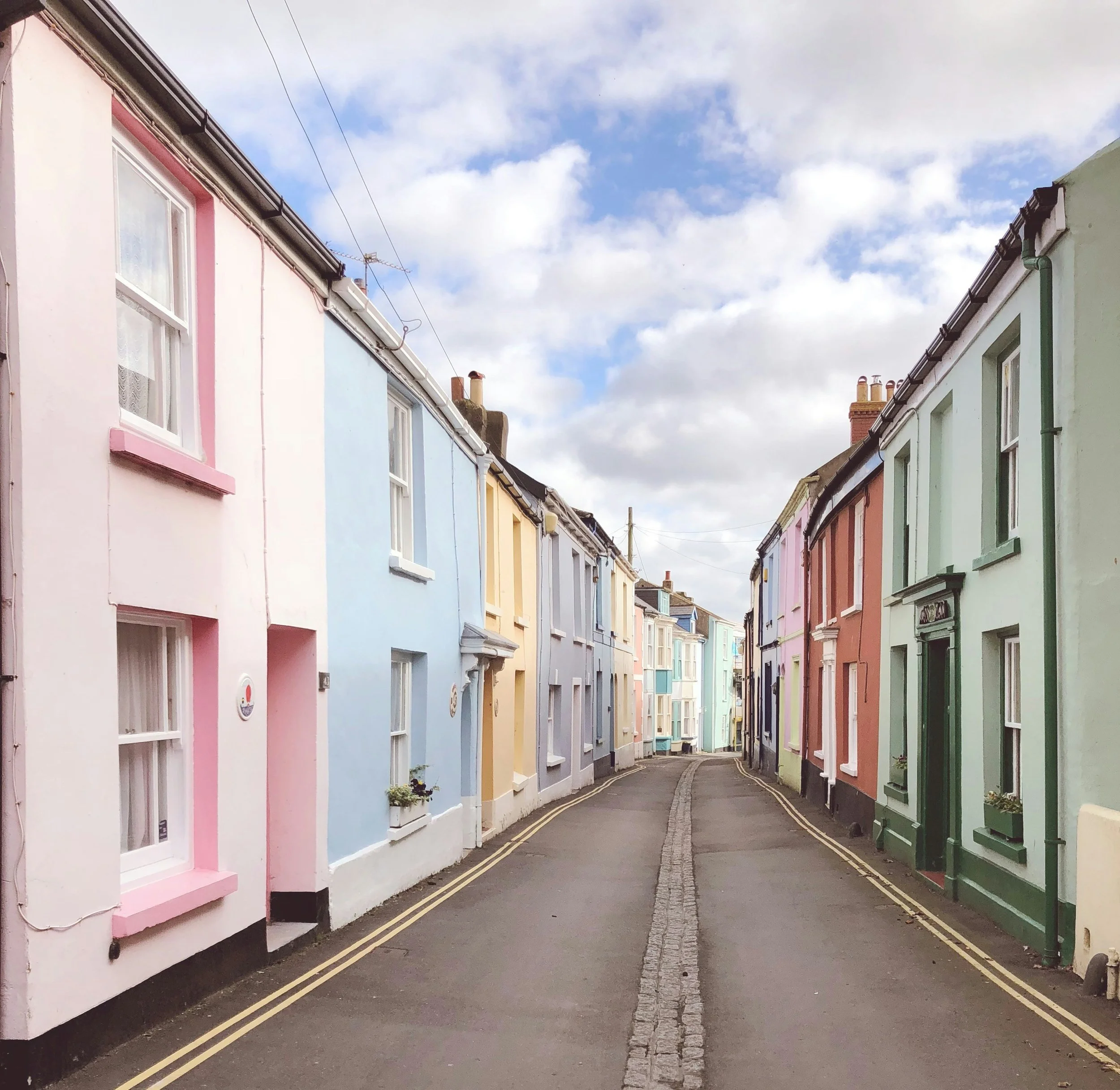
Last weekend, I drove down to Devon for an impromptu seaside break: ice cream, fish and chip, dodging seagulls, impossibly cheerful pastel-coloured houses that look like a row of macarons. Classic British seaside therapy.
This morning, I stumbled across research about #gelatocore, and suddenly those butter-lemon yellows and soft peach facades made perfect sense. According to Faire, a wholesale marketplace, British consumers are embracing Italian ice cream aesthetics: pistachio searches have surged 600%, vanilla climbs 400%, and mint follows at 130%.
However, this isn't a national trend. Cornwall has seen 136% growth in pastel-themed products, Devon up 127%, Brighton 106%. Meanwhile, Manchester managed just 3% growth, Leeds 25%. Usually, urban centres drive cultural shifts outward. Not this time. The seaside is setting the pace while Manchester, typically so trend-forward, finds itself trailing behind. There's something rather satisfying about that reversal.
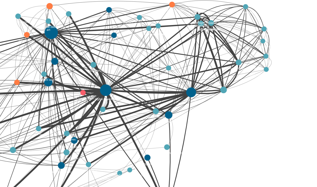
So I also wanted to see how “gelato core” is talked about online. Looking at social listening data from YouScan Social Listening ✨, it tells a more nuanced story than the sales figures alone. Rather than the typical hub-and-spoke pattern you see with influencer-driven trends, #gelatocore shows multiple dense clusters. Based on this data, we're not just shopping for colours; we're buying into an entire coastal fantasy.
We see how #gelatocore has spilled beyond food into everything from hair perfumes to candles to homewares. The YouScan data shows dominance of terms like “wall art” and “digital download”. Consumers are looking for art prints to bring that “pastel coastal” vibe into their homes. The sheer volume of “digital download” mentions, even more than individual product types, strongly suggests a significant lean towards accessible, perhaps even DIY, décor solutions.
Beyond wall art, the clusters consistently support the trend's deep roots in general home décor; think “beach house décor” and “cottage décor”. It's not just about a specific colour like butter yellow (though that's definitely a key player), but rather a broader colour palette. It’s the overall pastel coastal aesthetic that people are looking to bring into their living spaces.
The social listening data shows that these conversations are about mood, aspiration, the simple pleasure of choosing joy over restraint. #gelatocore is influencing how people furnish and style their coastal-inspired homes, with a preference for convenient and visually appealing décor options.
In a world where algorithms usually predict our desires before we know them ourselves, #gelatocore feels refreshingly spontaneous. It's about walking back from the beach, past the pastel-coloured houses, feeling the warmth of the seaside sunlight. It makes us choose soft peach over beige, and allows ourselves to be pulled towards butter yellow than being pushed by marketing.